The Foundation of Visual Creation: Elements of Art and Design
This guide covers everything about what are the elements of art and design. Imagine browsing a new website in 2026. You might notice its clean layout, vibrant colors, or the way images draw your eye. These aren’t random choices; they’re the result of carefully applied elements of art and design, which are the fundamental building blocks artists and designers use to communicate visually.
Last updated: May 1, 2026
- The seven core elements of art and design are line, shape, form, color, value, texture, and space.
- Each element plays a distinct role in conveying meaning, emotion, and structure in a visual composition.
- Understanding and applying these elements is crucial for effective visual communication, from graphic design to fine art.
- By mastering these fundamentals, you can elevate your own creative projects and better appreciate the work of others.
1. Line: The Most Basic Element
A line is the most fundamental element, a mark connecting two points. It can be straight, curved, thick, thin, or implied. Lines define edges, create contours, suggest movement, and guide the viewer’s eye.
Think of the bold, black outlines in a comic book that clearly separate characters from their background, or the subtle, implied lines in a minimalist logo that hint at a larger shape.
Practical Insight: Experiment with different line weights and styles in your sketches. A thick, jagged line conveys energy, while a thin, smooth line suggests calmness.
2. Shape: Two-Dimensional Boundaries
Shape refers to a two-dimensional area that has recognizable boundaries, created by lines or other elements. Shapes can be geometric (like circles, squares) or organic (like clouds, leaves). They provide structure and form to a composition.
A stop sign is a distinct geometric shape (octagon) instantly recognizable for its function. Organic shapes, like the silhouette of a tree, add natural fluidity to a painting.
Practical Insight: In branding, geometric shapes often convey stability and order, while organic shapes can feel more approachable and natural. Choose shapes that align with your message.
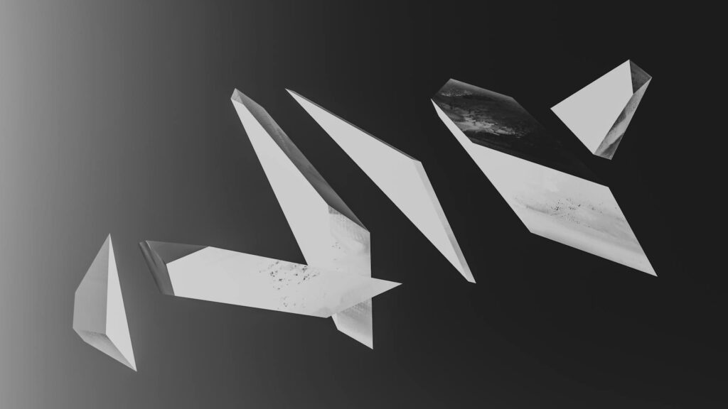
3. Form: Giving Objects Dimension
Form extends shape into three dimensions, possessing height, width, and depth. It’s what gives an object its solidity and volume. Form can be implied through shading, perspective, or actual physical mass.
A sculptor creates actual form with clay or stone. A painter implies form on a canvas using light and shadow to make a sphere look round, not flat.
Practical Insight: When designing 3D objects or even 2D graphics that aim for realism, consider how light would interact with the form to create convincing shadows and highlights.
4. Color: Evoking Emotion and Meaning
Color is perhaps the most expressive element, influencing mood, perception, and symbolism. It has three main properties: hue (the pure color), saturation (intensity), and value (lightness/darkness).
The vibrant blues and greens of a nature scene evoke tranquility, while the fiery reds and oranges of a sunset create a sense of drama. According to Adobe (2025), color plays a significant role in brand recognition, with studies showing that up to 90% of quick brand judgments are based on color alone.
Practical Insight: Explore color theory complementary colors create high contrast, analogous colors create harmony. Use color intentionally to guide viewer emotion and attention.
5. Value: The Lightness or Darkness
Value refers to the lightness or darkness of a color or tone. It’s crucial for creating contrast, depth, and a sense of three-dimensionality. A wide range of values makes an image more dynamic.
A black and white photograph relies solely on value to depict form and mood. High contrast between light and dark areas can create a dramatic effect, while subtle gradations suggest softness.
Practical Insight: Even in full-color work, understanding the underlying value structure is key. You can convert images to grayscale in photo editing software to check their value composition.
6. Texture: The Surface Quality
Texture is the perceived surface quality of an object how it feels or looks like it would feel if touched. It can be actual (tactile) or implied (visual).
A rough, impasto painting by Van Gogh has actual texture. A photograph of rough bark implies texture through visual cues like detail and shadow.
Practical Insight: Incorporate varied textures in your designs to add visual interest and a sense of realism. Think about how different materials feel and look, and how that translates visually.
7. Space: The Area Around and Within
Space refers to the area around, between, or within elements. It can be positive (the subject matter) or negative (the empty space). Effective use of space creates balance, hierarchy, and focus.
In Japanese art, the deliberate use of negative space, known as ‘ma’, is as important as the positive elements. In web design, ample white space makes content easier to read and navigate.
Practical Insight: Don’t be afraid of empty space. It gives your design breathing room and helps the viewer focus on the essential elements. The interaction between positive and negative space is key to good composition.
The Interplay: Elements Working Together
These elements rarely work in isolation. They combine and interact to create a cohesive whole. The principles of design (like balance, rhythm, emphasis) dictate how these elements are arranged.
A well-designed website uses lines to guide the eye through content, shapes to define buttons, color to highlight calls to action, and space to ensure readability. The overall composition balances these elements to create a user-friendly experience.
Practical Insight: When critiquing art or design, try to identify how each element is used and how they contribute to the overall message or feeling.
How to Apply Elements of Art and Design in Your Projects
Whether you’re designing a logo, painting a landscape, or arranging furniture, understanding these elements is key. As of May 2026, digital tools offer incredible flexibility in manipulating these elements.
- Define Your Goal: What message do you want to convey? Who’s your audience?
- Sketch with Elements: Before digital tools, brainstorm using basic shapes, lines, and value studies.
- Select a Color Palette: Choose colors that evoke the desired mood and align with your brand or subject. Consult resources on color psychology for guidance.
- Focus on Contrast: Use value and color to create focal points and ensure readability.
- Consider Texture: If applicable, think about how texture can add depth and realism.
- Manage Space: Ensure a balanced composition with effective use of positive and negative space.
Real-World Application: Elements in Action
Consider Apple’s product design philosophy. Their iconic products, like the MacBook Pro, showcase mastery of these elements. They use clean, precise lines and simple geometric shapes, and the aluminum form provides a smooth, cool texture. Their limited, sophisticated color palettes (silver, space gray) emphasize value and form. Ample negative space in their interfaces and packaging contributes to a premium, uncluttered feel. This deliberate application of elements creates a strong brand identity that resonates globally.
Common Mistakes and How to Avoid Them
Many creators stumble when they don’t consider the interplay of elements. A common mistake’s overusing color, which can make a design feel chaotic and overwhelming. Another is neglecting negative space, leading to cramped, hard-to-read compositions.
Solution: Step back from your work. Ask a friend for their initial reaction. Often, simplifying, reducing visual noise, and ensuring clear hierarchy by adjusting values and space can dramatically improve a piece. Resources like the Nielsen Norman Group provide extensive research on usability in design, highlighting the importance of clear visual hierarchy and ample whitespace.
Expert Insights: Beyond the Basics
A truly impactful piece of art or design doesn’t just use elements; it imbues them with intention. For instance, the deliberate use of an ‘implied line’ can create a more sophisticated and engaging experience than a literal one. Similarly, understanding how value can be used not just for realism but to create emotional tension or harmony is a hallmark of advanced practice.
Unique Insight: In 2026, with the rise of generative AI art, understanding these foundational elements becomes even more critical. AI can mimic styles, but a human artist’s intentional manipulation of line weight to convey subtle emotion or the strategic use of negative space to create a sense of profound isolation these are the nuances that still distinguish masterful human creation.
Frequently Asked Questions
What are the 7 basic elements of art and design?
The seven basic elements are line, shape, form, color, value, texture, and space. These are the fundamental building blocks that artists and designers use to create visual compositions and convey meaning.
How does line function as an element of art?
Line functions by defining edges, creating contours, suggesting movement or direction, and guiding the viewer’s eye through a composition. Its thickness, style, and curvature all contribute to its expressive quality.
What is the difference between shape and form?
Shape is a two-dimensional area with defined boundaries, like a circle. Form is three-dimensional, possessing height, width, and depth, like a sphere. Form essentially gives shape volume.
Why is value important in design?
Value is crucial because it creates contrast, defines forms, establishes a sense of depth, and can evoke mood. High contrast between light and dark areas can create drama, while subtle gradations suggest softness.
How can texture enhance a visual design?
Texture enhances design by adding visual interest, a sense of realism, and tactile appeal. Whether actual or implied, texture can make a flat image feel more dynamic and engaging.
What role does space play in composition?
Space plays a critical role by defining relationships between elements, creating balance, establishing hierarchy, and directing focus. Effective use of both positive and negative space is essential for clarity and impact.
Mastering Your Visual Language
The elements of art and design are your essential toolkit for creating impactful visuals. By understanding and intentionally applying line, shape, form, color, value, texture, and space, you can communicate more effectively and powerfully.
Actionable Takeaway: Choose one element you feel weakest in and spend 30 minutes this week consciously observing it in your surroundings or intentionally practicing it in a small sketch.
Source: Britannica
Editorial Note: This article was researched and written by the Onnilaina editorial team. We fact-check our content and update it regularly. For questions or corrections, contact us.
Related read: Composition in Art and Design: Beyond Pretty Pictures